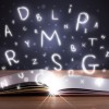
Some of your favorite fonts took an immense amount of work, creativity, out-of-the-box thinking and additionally, certain tools, to create. For example, Wired magazine reported that the ever-popular Helvetica was created with molten metal, and the elegant Garamond character set was originally hand-drawn with a quill. Others, like Gotham, were created with computer software. A new font emerged, and was crafted in a unique way: with magnets. "Peak," which was designed by Ariane Spanier, is unlike any other font you've seen before. The unique textural appearance of these letters resembles what happens to
strong magnets when they're exposed to
ferrofluid, with dramatic jagged peaks and valleys on each character.
A Unique Concept
According to Wired, Spanier created Peak
on behalf of an app called Notegraphy, which allows users send notes to friends featuring exclusive fonts. She had total freedom in the design process, except that the characters need to fit a specific Notegraphy layout. Spanier did a considerable amount of research on typography before coming up with her idea. In the process, she learned that New York-based graphic designer and typographer Stefan Sagmeister made a typeface with numerous unconventional items, including exhaust tubing and bananas. After realizing the endless possibilities, Spanier designed a a playful, passionate, and innovative typeface.
"I immediately felt the urge to create something dimensional, in contradiction to the flat screens of the computers, tablets or phones," she told Wired. "Something that almost climbs out of the screen towards you."
An Experimental Process
So how did she achieve this objective? While she experimented with ferrofluid, she ended up using a solution of thicker acrylic paint mixed with iron filings to create a similar effect. She started by painting each letter on a postage-stamp-sized white plastic sheet, which would serve as her canvas. Before the pigment was dry, she put the magnet underneath her tiny canvas. The iron filaments repel from the surface, awe-inspiring spiky shapes formed on the letters. The process did demand some trial and error, however. She had to play with the directions of her paint strokes. She adjusted the polarized pigment thickness and the placement of the magnets to get the desired effect. Wired explained that while large magnets were too weak, small
disc magnets were too strong.
It may not be the best pick for professional typing scenarios, Peak is a fun addition to the typography realm. On Spanier's website, she
recommends the font for "retired alpinists, adventurous nerds, sharp-thinking folks, wistful punks, avant-garde housewives and edgy biologists."
Discover More With Apex Magnets
Want to stay up-to-date on the latest magnetic discoveries and magnet fun facts? Sign up for our newsletter to get these stories and more sent straight to your inbox each month.